


The Brief
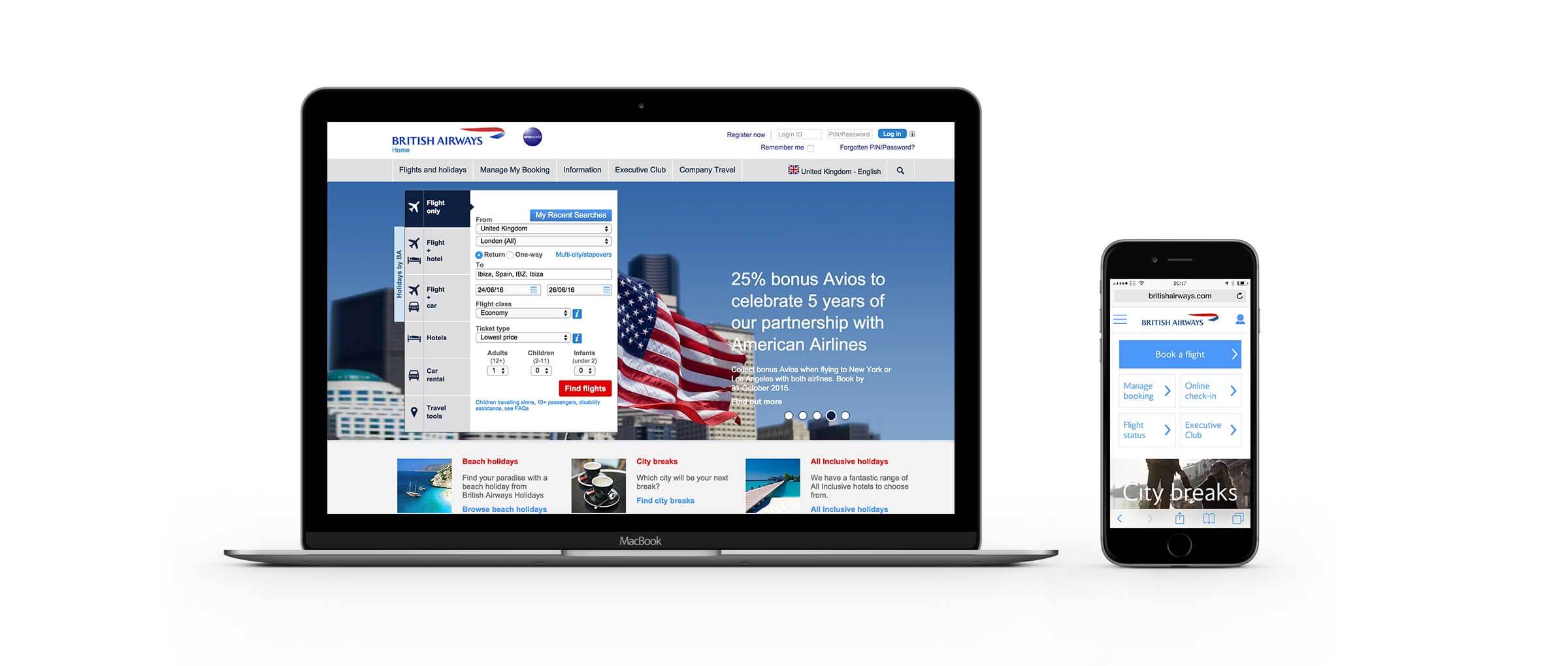
British Airways needed a responsive redesign of their current ba.com website. British Airways currently has a desktop website and a completely separate, stripped down mobile website. The aim of the responsive project was to redesign the existing desktop site, component by component, ensuring these worked responsively across all salient viewports and thus remove the need for a separate mobile version.

The challenges
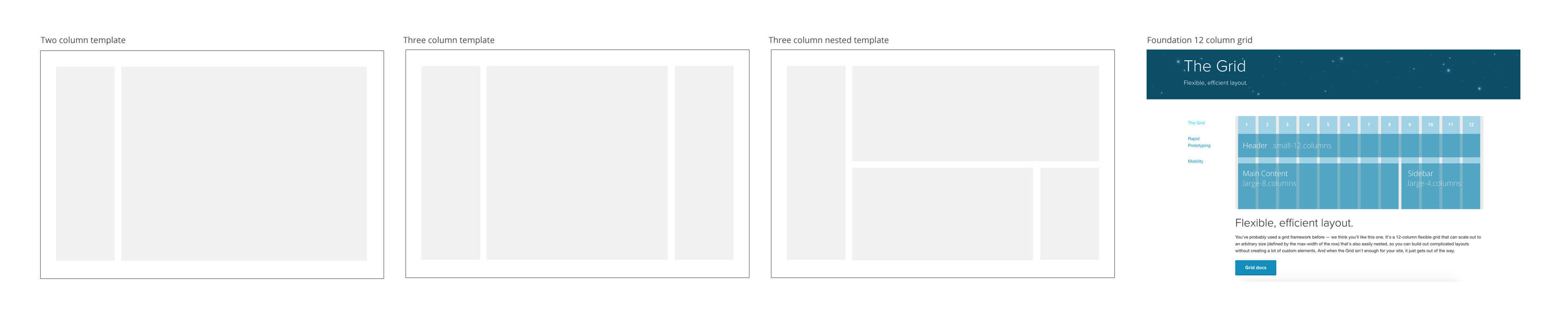
1. Layouts and the grid
We were required to work with the existing structure and back end as much as possible. The content pages themselves were column based and originally designed for editorial teams to easily construct new pages via the CMS. The dev team decided on working with Foundation js to a 12 column grid. The very difficult challenge here was to use the current templates but reworking them to Foundation’s fluid 12 column grid system whilst ensuring certain components and content could be prioritised over others.

2. Min-Max width's
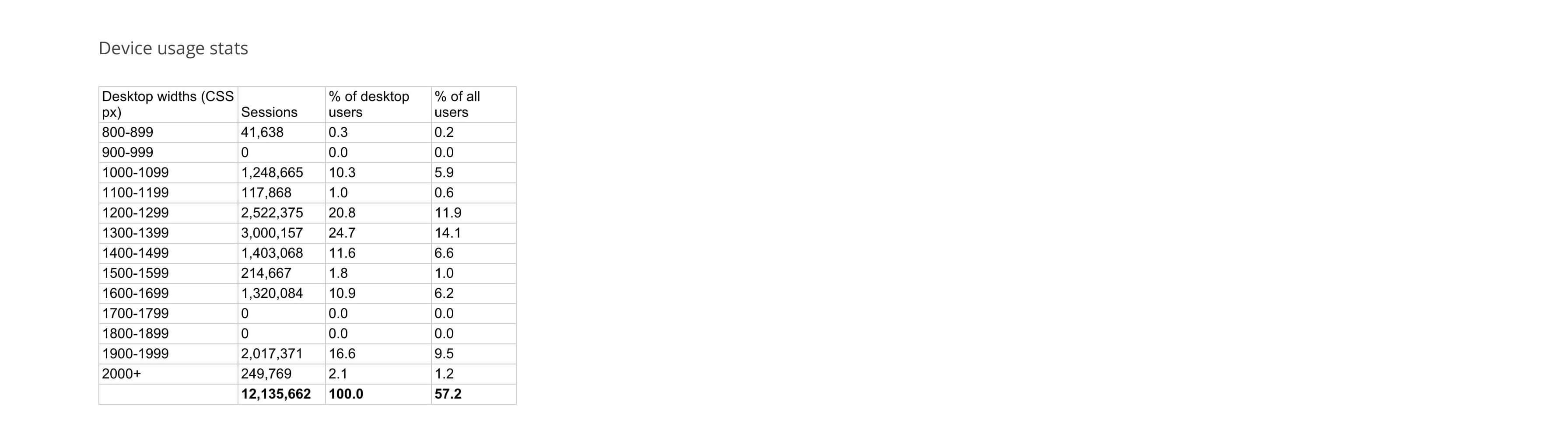
Pulling stats on customer device usage, we found - quite surprisingly - that a large percentage of users where accessing ba.com on viewport sizes between 1600 -2000px. The site currently has a fixed width of 980px so we decided to further investigate the pros and cons of scaling up and how this could affect each component.

3. Secondary Navigation
The constraints of the underlying templates and CMS prevented us from completely redesigning this component in a more suitable way. Ideally, to sit with the global navigation. Unfortunately the backend wouldn't allow for 'breaking' columns in order to prioritise information so we were left with limited solutions.
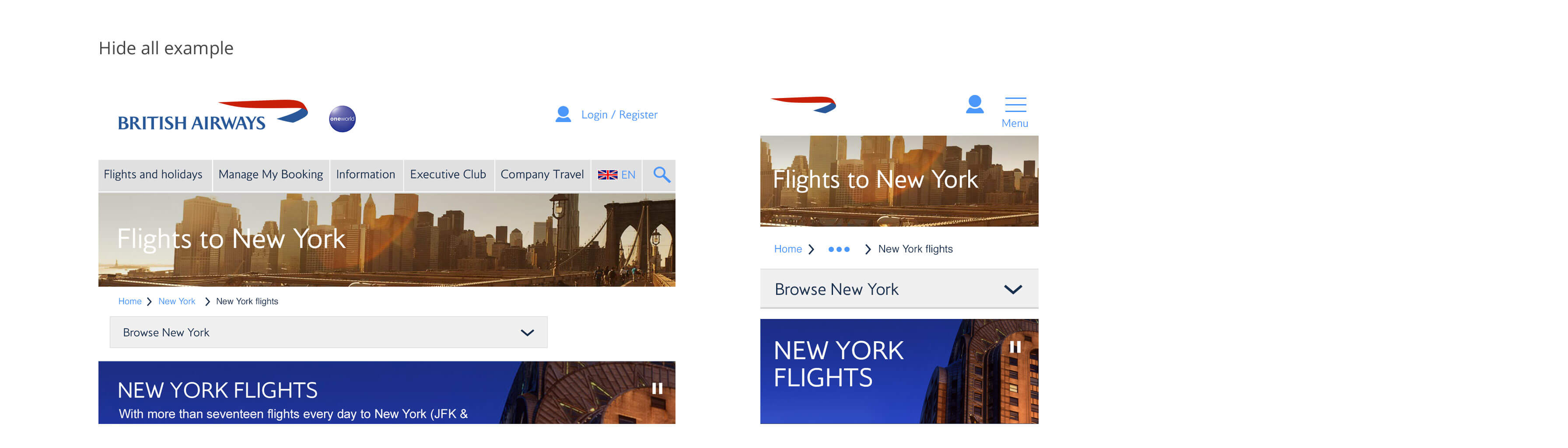
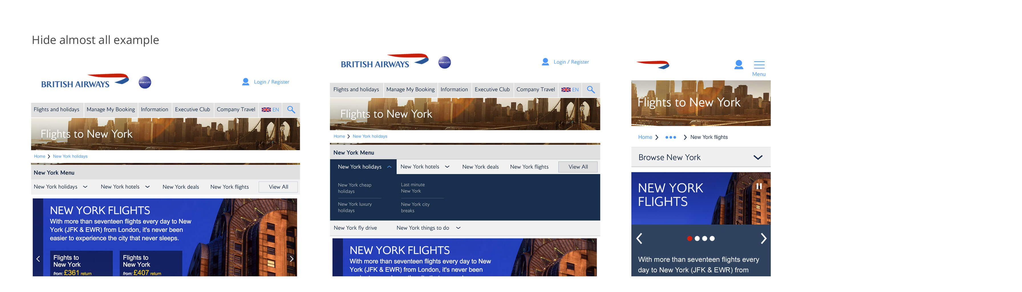
Two of these solutions are shown in the below examples.


Solution 1: Hide everything
At the 800 breakpoint, the secondary navigation layout will switch to a dropdown selection, effectively hiding all of the secondary navigation until click or tap actions are performed to expand and reveal the navigation.
Pros/cons:
Although a simple and 'clean' option, hiding all within one dropdown decreases discoverability of these links severely. If this navigation type is overlooked, which could easily happen considering it's size has been drastically reduced at these lower breakpoints, then none of the content will be surfaced to the user.

Solution 2: Hide almost everything
Again, at the 800 breakpoint, the secondary navigation layout will switch to show the first few links in the navigation presented horizontally as well as a 'view all' button at the far right to access all other links.
Pros/cons
Serving more navigational items as the browser width increases allows the user a greater understanding of the function of the item, and with an obvious 'view all' button, that it contains even further items still. The difficulty however is in showing a clear hierarchy of parent and child items in relation to the category, for this navigation to work, the relationship of these items need to be clear.

4. Functional Flows: Low Price Finder
After design was completed on content page components, I moved on to functional flows - areas of the site that were task specific. The Low Price Finder is a high traffic page where users can select travel destinations and are presented with an overview of prices across the next 12 months. From here, they can select a specific month, day of departure and passenger numbers before moving through to the 'selling flow'.
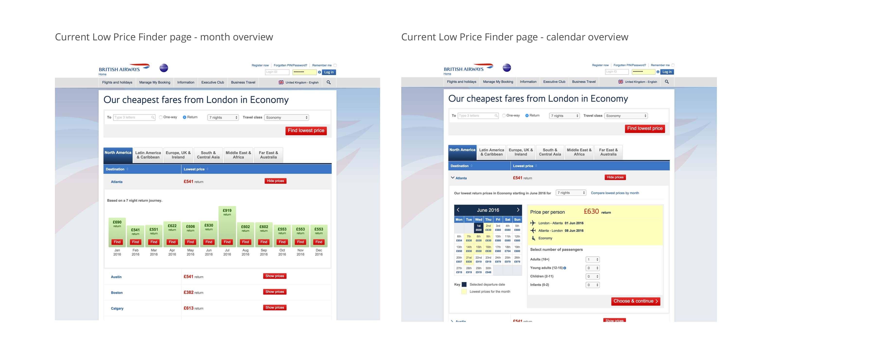

Region Tabs
The current low price finder contains destinations over 5 regions and the user is able to access their desired city destination by selecting the region that it resides in. This tabbed based design works well at the larger viewports as it relies on viewport width but below 800px these 5 tabs cannot fit.
One option that was looked at was serving only one region at a time and creating a dropdown menu for users to access the other regions. This worked well in saving space but it’s drawbacks included lack of discoverability (where the menu icon may be overlooked and the remaining four regions never discovered) and icon duplication (where the global navigation also displays the ‘hamburger’ icon as a dropdown menu)


More to come...